The homepage is a customer's first impression of Apollo every time they sign in. When done right, it becomes their hub, offering a birds-eye view of vital information, setting the stage for a productive workflow; it also becomes a significant opportunity to drive feature discovery with Apollo.
Designing a Homepage experience that surfaces relevant content at a glance, drives feature discovery and highlights Apollo’s ROI in achieving users' goals can unlock improvements in retention and revenue growth. It’s a clear objective—but a challenging one to achieve!
This blog explores a unique concept of building a homepage that is personalized at scale. It is engineered on top of a “Dynamic Page Framework” and a robust “Widgets Library,” both designed to prioritize modularity, flexibility, and user-centric customization for modern web applications.
🏡 Reimagining the Home Page
Apollo's audience is diverse, encompassing various stages of the GTM motion with distinct roles, responsibilities, skills, and decision-making capabilities. A one-size-fits-all homepage wouldn’t provide optimal value. After exploring several ideas, the solution became clear: a "Lego block" approach.
Why not empower users with customizable Lego-like blocks to create a homepage that maximizes their ROI? Start with pre-designed templates, based on Apollo's insights into what users find most valuable. As users become familiar with Apollo's platform, they can personalize their homepage to fully leverage Apollo's capabilities across different product areas.
Subsequently, the plan was to design a single-column layout with unlimited rows, allowing users to add widgets anywhere and arrange them according to their preferences. Beyond just placement, we envisioned giving users the ability to dynamically add widgets, offering a level of freedom and customization that was unparalleled. This approach would make the home page not only functional but also a personal, dynamic workspace.
🧱 The Building Blocks
The Dynamic Page Framework has 3 essential components:
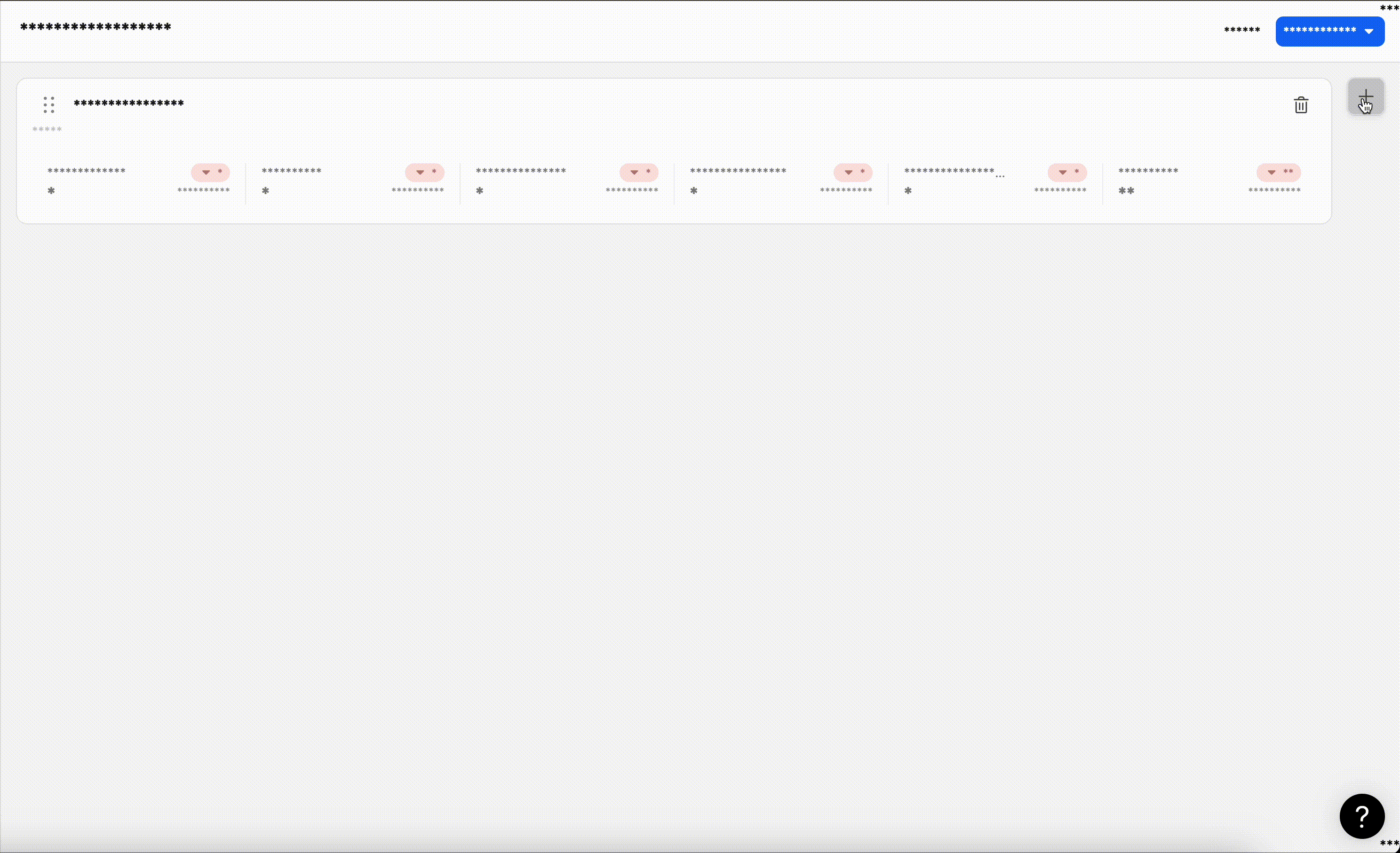
1. The Toolbar
- The toolbar is the cornerstone of layout management and sits at the top of the page framework.
- Key features:
- Viewing and managing all available layouts.
- Handling access permissions.
- Performing actions such as editing, selecting, or switching layouts.
- It also allows users to effortlessly toggle between edit mode and view mode, ensuring a smooth user experience.
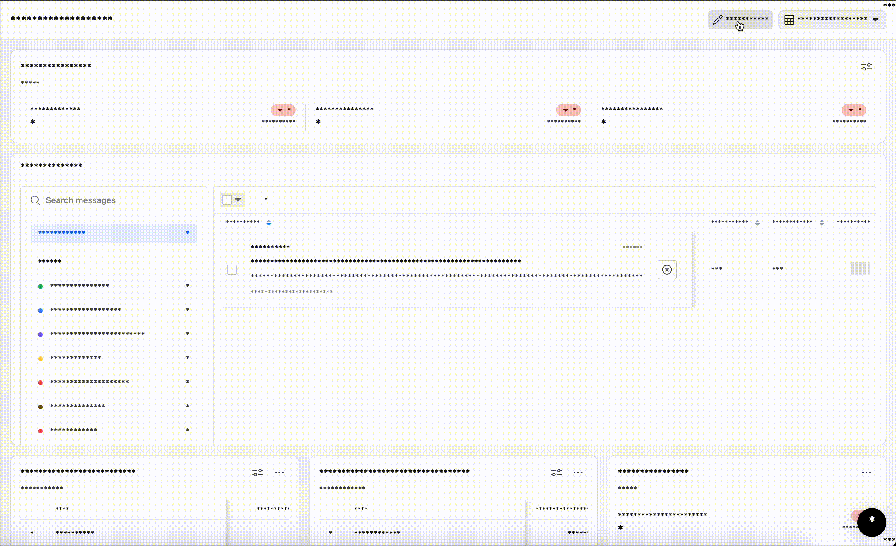
2. The Page Layout (Canvas)
- The page layout is the canvas where the magic happens. This is where the actual page is rendered, composed of one or more widgets.
- Key features:
- Dual Modes: The layout supports both view mode and edit mode.
- Customization: In edit mode, users can:
- Rearrange widgets with drag-and-drop functionality.
- Resize widgets to adjust their dimensions for a tailored fit.
- Remove widgets when they’re no longer needed.
- This dynamic and responsive layout makes it easy for users to create a dashboard that suits their unique needs.
3. The Widget Library
- The widget library acts as a centralized hub for all supported widgets in the Apollo app.
- And a widget is a container that can house a range of components - could be a graph, an email inbox or a table. The loose coupling here allows us to expand the library significantly.
- Key features:
- A comprehensive assortment widgets.
- Drag-and-drop functionality, enabling users to quickly add widgets to their layout.
- By providing an intuitive way to access and integrate widgets, the library empowers users to build layouts with ease and flexibility.

🧑💻 The "Layout" Model
The Layout Manager serves as the controller and entry point for managing pages within Apollo. Its primary responsibility is to determine the currently active layout for the user. By default, Apollo provides system-defined layouts, which users can later overwrite and customize based on their preferences.
Once the layout is retrieved, its most critical attribute is the widgets information. This attribute contains the metadata required to identify each widget available in the layout. Each widget in the metadata has dimensions that dictate how it will be rendered on the page.
Sample Layout Model:
{
    "id": "",
    "widgets": [
		    {
		        "id": "",
		        "dimensions": {
		            "height": 156,
		            "width": "50%",
		            "row_order": 0,
		            "column_order": 0
		        },
		        "type": "Widget A",
		    },
		    {
		        "id": "",
		        "dimensions": {
		            "height": 156,
		            "width": "50%",
		            "row_order": 0,
		            "column_order": 1
		        },
		        "type": "Widget B",
		    },
		    ...
		],
   ...
}
🧩 The "Widget" Model
Our vision is to build a comprehensive and versatile widget library that meets the diverse needs of our users. As mentioned above, a widget is essentially a container holding a visualization or functional component. For today, we’ll take a closer look at one of them: the Analytics Report Widget. The Analytics Widget offers a range of features, enabling users to access and interpret their data in various formats, such as:
- Visualization Charts: Graphical representations to track trends and patterns.
- Data Tables: Organized, detailed views of raw data for deeper analysis.
- Summary Statistics: Key performance metrics at a glance.
The widgets are designed to be independent of the layout and other widgets on the page. Each widget is solely responsible for rendering the content it is intended to display, based on the layout widget type provided by the Layout Manager. Interestingly at times, the widget also carries a unique entity identifier, which enables it to communicate with the backend and fetch all the necessary data points for rendering. This information is also supplied by the Layout Manager.

🧤 The "Drag & Drop"
The capability to move around widgets and arrange them exactly how you would want it is crucial for personalization. In edit layout mode, the core third-party library we use is @dnd-kit, which allows us to render a canvas as a grid. The layout editor can rearrange, resize, or delete widgets directly. During editing, interactions within widgets are disabled. Users can also drag and add new widgets from the library. Once their preferred layout is ready, they can save it.
🧗♂️ Roadblocks
-
One of the key challenges we faced was ensuring the responsiveness of our layout. Since the dimensions of each widget are driven by the backend, storing widget widths in pixels wasn’t an option. Unlike heights, which can be scrollable and defined in pixels, widths needed to dynamically adapt based on the available space. After some creative brainstorming, we developed a solution: a custom hook. This hook acts as a middle layer, converting the widget widths—stored as percentages in the backend—into pixel values for precise rendering. The calculations dynamically adjust based on the total space available within the container.
This innovative approach allowed us to deliver a seamless user experience across devices, ensuring that widgets look and function perfectly even during page or window resizing. The result? A layout that feels effortlessly fluid, no matter the screen size.
-
When designing a reusable framework, we aimed to ensure that our widget library was completely independent of the Layout Manager. However, we also wanted to provide users with the flexibility to drag and drop widgets from the library directly onto the page canvas—a feature central to our vision of an intuitive interface.
Through thorough research, we discovered a limitation in
@dnd-kit, which does not support dragging items rendered within oneDndContextto another one. To overcome this, we took a creative approach by designing the layout interface to accommodate external integrations. This design enables other parts of the app to implement their own versions of widget listings, ensuring they remain compatible with theDndContext.
🏆 Results & Performance
We saw 3 clear wins once the redesigned Homepage was rolled out:
- It has significantly boosted user engagement and retention, with more users taking initial actions and returning to perform additional tasks.
- Retention has steadily improved, underscoring the impact of the redesign in fostering ongoing engagement.
- User preferences highlight the success of the new layout, with a clear shift toward more actionable and user-friendly dashboards.
These trends validate the redesign's impact and open doors for further enhancements to refine the user experience.
📡 The Future
With the foundation set, we aim to extend the dynamic framework across the app, supporting more widgets and use cases. Personalization is a core focus—tailoring widgets to reflect individual user journeys for greater relevance and insight.
This evolution will transform widgets into adaptive, intuitive tools, enhancing engagement and making the application smarter and more responsive to user needs.
🚀 .....and we are hiring!
Problem statements like these are in plenty at Apollo and we are betting big on AI for building products for our customers. Our engineering team thrives on solving complex problems, pushing the boundaries of what’s possible with data, and delivering cutting-edge solutions that drive "impact".
We are looking for smart engineers like you to join our "fully remote, globally distributed" team. Click here to apply now!